Ink Wash or Saturated Colour: Two Screen Worlds
Ink wash or saturated colour can steer a scene’s mood and focus; compare contrast, colour placement, and movement to choose a visual grammar with purpose.
The common mistake in choosing between ink wash and saturated colour is treating one as quiet and the other as loud. That shortcut can leave a scene visually polished but emotionally vague: viewers notice the palette without understanding where to look or what to feel. Ink wash or saturated colour works best as a system for directing attention, not as a mood preset.
What does each visual approach ask you to notice?
An ink-wash look builds its image from tonal relationships: dark, middle, and pale areas, with detail emerging from their edges and intervals. It may use monochrome, near-monochrome, or a narrow range of hues. The important feature is not the absence of colour but the way values carry the image. A face can emerge from a shadow; a blank wall can become active because a figure crosses it.
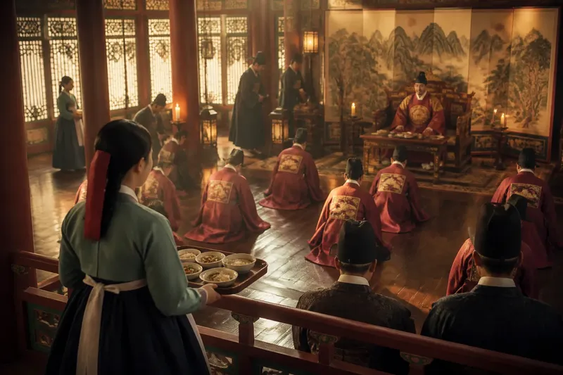
Saturated colour organizes attention through hue, intensity, and contrast. A vivid red coat against muted surroundings, for instance, can become the first point of attention, while a field of closely related jewel tones may make the frame feel dense and enveloping. Saturation alone does not make an image energetic. If every object competes at equal intensity, the viewer may have nowhere clear to settle.
Both approaches can feel restrained or intense. A nearly colourless frame with a hard black shape can be severe. A bright palette with carefully repeated hues can feel composed rather than exuberant. The practical question is what visual information should arrive first, and what should remain available for a second look.
How can ink wash or saturated colour shape attention?
Begin with the scene’s visual hierarchy. In an ink-wash design, hierarchy often comes from value separation, silhouette, texture, and the use of empty space. In saturated colour, it may come from a single hue that breaks a pattern, from warm and cool areas placed against each other, or from a gradual change in intensity across the frame.
Consider how the eye moves after finding its first point of focus. A dark doorway can direct attention toward a pale figure beyond it. A repeated blue-green field can hold the eye in one part of the frame, while a small amber object pulls it elsewhere. These choices can shape a scene’s emotional rhythm without relying on explanatory dialogue.
Colour and tone also change how surfaces read. A rough wall may become prominent through sharp tonal contrast, even without vivid hues. Saturated light can flatten that same texture or make it feel tactile, depending on its direction and the surrounding colours. A palette is therefore not a finish applied after composition; it affects the perceived weight and distance of objects.
How would the choice work in one scene?
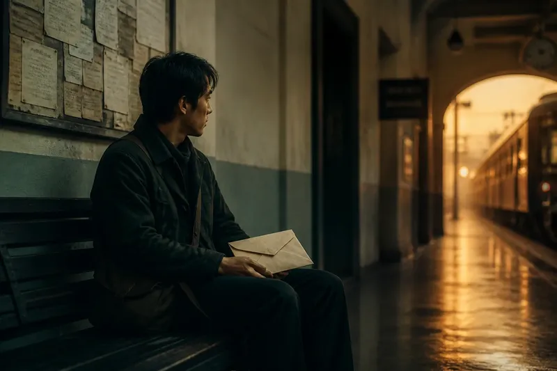
Imagine a clearly hypothetical scene in which a courier waits in a quiet station corridor while a train is delayed. At the start, the corridor has pale walls, a dark bench, and a noticeboard crowded with paper. The courier holds a sealed envelope and watches the empty platform. The scene needs to express waiting while keeping the envelope meaningful, without making it seem like an alarm signal.
For an ink-wash treatment, the designer could keep the corridor within a narrow range of greys and let the envelope remain a light shape against the courier’s dark coat. The bench and doorway would form stronger dark masses, while the noticeboard would dissolve into softer marks. As the courier shifts position, the envelope would cross from the coat’s shadow into the pale wall’s visual space. The expected observable result is a small, readable change in attention: the envelope becomes easier to see because of its surroundings, not because it has been coloured like a warning.
For a saturated treatment, the designer could give the corridor a restrained blue-green cast and use a warm amber light near the platform. The envelope might stay cream, so it remains distinct without turning into the brightest object. When the courier looks toward the train entrance, the warm patch would draw the eye along that glance. The expected observable result is a clearer visual link between the courier’s attention and the place where the train may appear. The scene’s tension would come from the relation between cool waiting space and warm threshold, rather than from brightness everywhere.
Neither version is inherently more suspenseful. The first makes shape and negative space carry the pause; the second makes temperature and colour placement carry it. A useful decision follows from the scene’s purpose: if the envelope’s physical presence matters, preserve its silhouette and value contrast; if the platform’s pull matters, let colour guide the gaze there.
Which questions help settle the palette?
Does an ink-wash look have to be black and white?
No. It can use muted hues or a narrow colour family while still relying chiefly on tonal separation. If colour remains subdued, check whether shapes and surfaces stay legible without it.
Can saturated colour still feel restrained?
Yes. Restrained colour can be vivid but selective, with a few hues repeated and one area given particular emphasis. The composition feels controlled when the brightest or most intense colour has a clear job.
How do you keep a vivid frame from feeling cluttered?
Give competing colours different roles and let some areas rest in less intense tones. Check whether the viewer can identify a first point of focus before noticing decorative detail.
What should guide the choice between the two?
Start with the attention you want the scene to direct and the details that must remain readable. Then consider whether tonal contrast or colour relationships can carry that task with fewer competing signals.
What is worth checking before committing?
Review a still frame in a small preview as well as at full size. In the small view, note what catches the eye first; at full size, inspect whether important textures and facial expressions remain clear. A grayscale preview can reveal whether a saturated design depends entirely on hue, while a colour preview can show whether an ink-wash design has enough separation between neighbouring surfaces.
Also consider how the palette behaves across adjoining shots. If every cut introduces a new dominant hue, the viewer may register the palette change more strongly than the scene’s emotional movement. Repeated colours can provide continuity, while a deliberate shift can mark a change in attention or space. The shift need not be dramatic to register.
Not worth the effort: assigning a symbolic meaning to every colour before seeing how it works in the frame. A red object does not automatically mean danger, and a pale image does not automatically mean calm. Test the visual relationship among objects, light, and background instead. If the story depends on a particular technical or production choice, follow the relevant equipment maker’s guidance and local requirements.
For ink wash or saturated colour, the most useful final check is simple: cover the dialogue and ask what the image directs you to notice, then ask whether that attention serves the scene. When the visual answer is clear, the palette has become part of the storytelling rather than a decoration laid over it.